


Are You Earning Up to Your Potential?
Most personal trainers are undervaluing their time and skills. Our Personal trainer Revenue Calculator helps you find out what you should be making, and how to get there.
No guesswork. Just real numbers.
.webp)
Think about the brands you admire the most.
Can you picture their logos in your mind? Notice how the image pops right up in your mind?
Just like people, brands have their own identity & the visual identity is their logo.
A logo often serves as the initial introduction to your brand. Its design, aesthetic, and overall vibe can either captivate or deter potential clients.
As a personal fitness trainer, your logo is more than just a symbol or a mere picture. It represents your training philosophy, commitment to health, and the transformative journey you can bring to your potential customers.
Standing out in a competitive market is crucial for success. With many options available to clients, your logo serves as a primary differentiator. It's the first handshake, the initial promise, the beckoning gateway to what you offer.
Given the immense competition in the fitness industry, designing the perfect logo that distinguishes you from the crowd requires thorough research into the market you're operating in, understanding your competition, and a deep dive into your unique value proposition.
Let’s deep dive into fitness logo design and how you can build a unique identity for your brand through it.
Understanding Your Target Customer

Do you guide your clients toward muscle-building? Or do you focus on helping them get fit without the intense weightlifting sessions?
These are merely starting points to help you pinpoint your expertise.
As a personal fitness trainer, you undoubtedly have certain strengths and specialities that set you apart.
Understanding your brand promise is pivotal to crafting the ideal logo for your fitness business. Every element of your design should resonate with what you stand for and what you offer your clients.
Begin by making a definitive list of what your brand guarantees its members. What do they stand to gain when they join your fitness class? It could be more than just physical health; it could be a sense of community, personal achievement, or even mental well-being.
For instance, if your brand's core promise revolves around intense, calorie-torching workouts, your logo should lean towards bold, dynamic elements that exude energy and determination.
Conversely, if your fitness methodology is centred on mindfulness and holistic wellness, you'd be more likely to gravitate towards designs incorporating calm, serene, and organic motifs.

However, while knowing which element to integrate is essential, it is equally crucial to discern what to exclude. Your logo should be devoid of any elements that don't align with your brand's promise.
If high-octane workouts are your thing, a tranquil lotus flower doesn't encapsulate your brand's essence.
Understanding your target customer will impact you; it guides you in crafting a great logo that embodies your essence and communicates your offerings effectively. Through this logo, you'll convey precisely who you are and what sets you apart in the fitness realm.
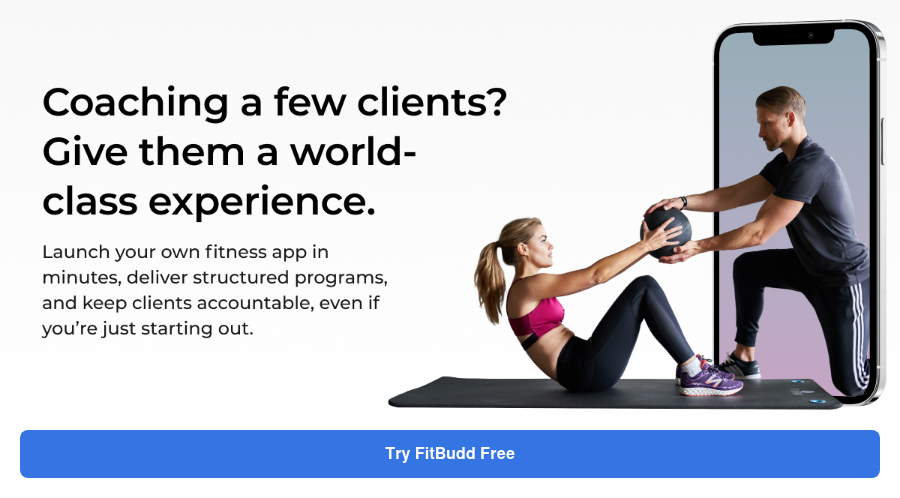
💪 Got an idea for a brand? Let's bring it to life.
Launch your own fitness app with FitBudd in minutes!
💪 Got your brand name? Let’s bring it to life.
Launch your own fitness app with FitBudd in minutes!


88% trainers worldwide gave us 5 stars
Transform your fitness business with the power of your branded app on iOS and Android.
Try for FREEPlay With The Color Psychology
Colors aren't just about aesthetics; they evoke emotions, trigger memories, and influence decisions. In branding, mainly when designing a logo, understanding color psychology is crucial. Let's delve into how you can leverage this to make your fitness brand more impactful:
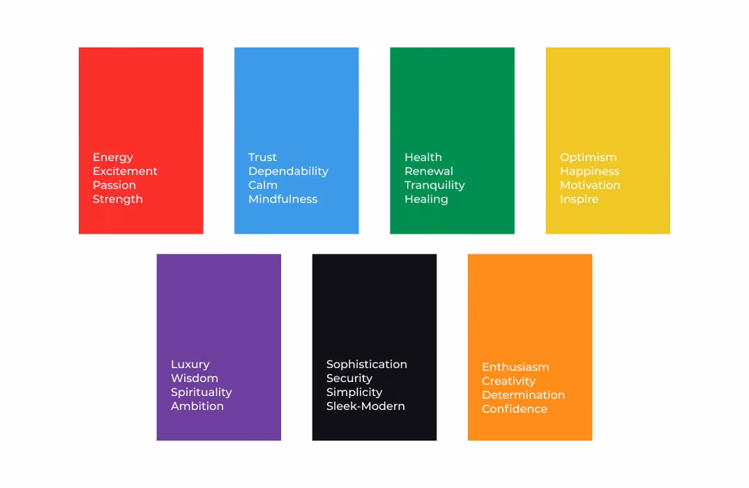
- Red: Often associated with energy, passion, and excitement, red can be an excellent choice for high-intensity workout regimes or fitness programs emphasizing strength and power.
- Blue: This hue is synonymous with trust, dependability, and calm. If your fitness approach is about holistic health, mindfulness, or steady progress, blue might resonate well.
- Green: Representing health, renewal, and tranquillity, green is an apt color for wellness centers, yoga studios, or fitness approaches that integrate nature and well-being.
- Yellow: The color of optimism, happiness, and motivation. Yellow can invigorate and inspire, making it suitable for fitness clubs aiming to uplift and energize their clientele.
- Purple: Associated with luxury, wisdom, and spirituality, purple can be perfect for high-end fitness centers or speciality training programs.
- Black/White: While black denotes sophistication, strength, and luxury, white signifies purity, simplicity, and peace. They can be used alone or together for a sleek, modern feel.
- Orange: A blend of red's passion and yellow's joy, orange represents enthusiasm, creativity, and determination. It might be apt for fitness brands aiming for a balanced physical health and joy approach.
When deciding on a color palette for your logo, always circle back to your brand's core philosophy and what you want your clientele to feel.
Dive deep into the psychology behind each color, and you'll find a hue that doesn't just look good but also resonates with your brand's voice and values.
Remember, your logo is often a prospective client's first interaction with you. Make it count by making them feel exactly how you'd want them to when they eventually step into your fitness world.
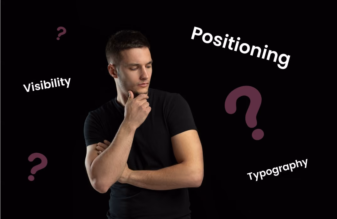
Choosing the Right Typography for Fitness Logos
The typography you select for your fitness logo is more than just letters; it's a crucial visual cue that sets the tone for your brand.
Like colors and illustrations, the font you choose for your design will evoke certain emotions and perceptions in those who view it. Here's how to ensure your typography aligns with your brand's values and message:

A. Typeface vs. Fitness Brand Personality:
Your font should be in harmony with your fitness brand's personality. Think about the feelings you want your audience to experience when they see your logo.
Strength Training Centers: If your fitness brand is about pumping iron and gaining muscle, consider bold, impactful typefaces. These fonts exude strength, determination, and power, matching the vibe of a hardcore gym.
Yoga or Meditation Studios: Opt for a more elegant and flowing script font for a serene and calming environment. These typefaces can convey peace, tranquillity, and a touch of spirituality.
Aerobic or Dance Classes: If your sessions are all about movement and rhythm, playful and dynamic fonts could be your inspiration and best bet.
B. Legibility and Adaptability:
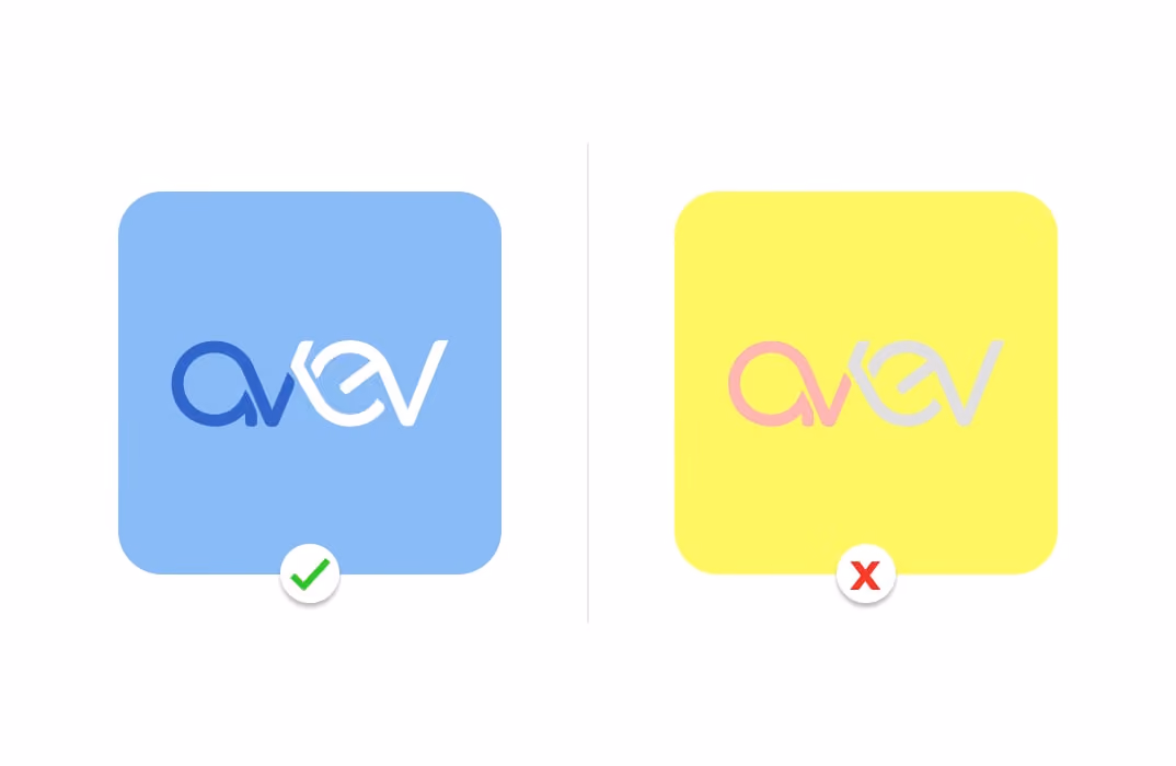
With the digital age upon us, your logo will appear everywhere - from giant billboards to the tiny screens of smartwatches. Thus, legibility across various platforms and sizes is paramount.
Scaling: A font might look appealing when large, but it's not the right choice if it loses its charm or becomes unreadable when shrunk. Ensure your selected typography remains crisp and legible on a business card or a poster.
Clarity: Fancy fonts can be enticing, but you should reconsider if they compromise clarity. Your logo's text should be discernible at a glance without any straining.
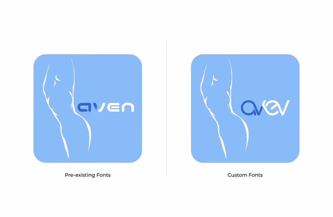
C. Custom vs. Pre-existing Fonts:
While a vast array of pre-existing fonts are available, there's also the option of creating a custom one tailored to your brand's vibe.
Custom Fonts: They offer uniqueness and can give your brand an edge in standing out. Tailored specifically for your brand, they encapsulate your brand's essence perfectly. However, they can be cost-intensive and require time to create and develop.
Pre-existing Fonts: Accessible and often more affordable, they're readily available and have been tried and tested in various contexts. The challenge, however, is finding one that aligns with your brand's personality and isn't overly common.
Spend time weighing options, experimenting, and, most importantly, aligning the typography with the core values and promises you've set for your fitness brand. Getting the right typography is an art; you should keep experimenting with it. Ask family, friends, and potential customers how they feel about the style of letters they see in your logo.
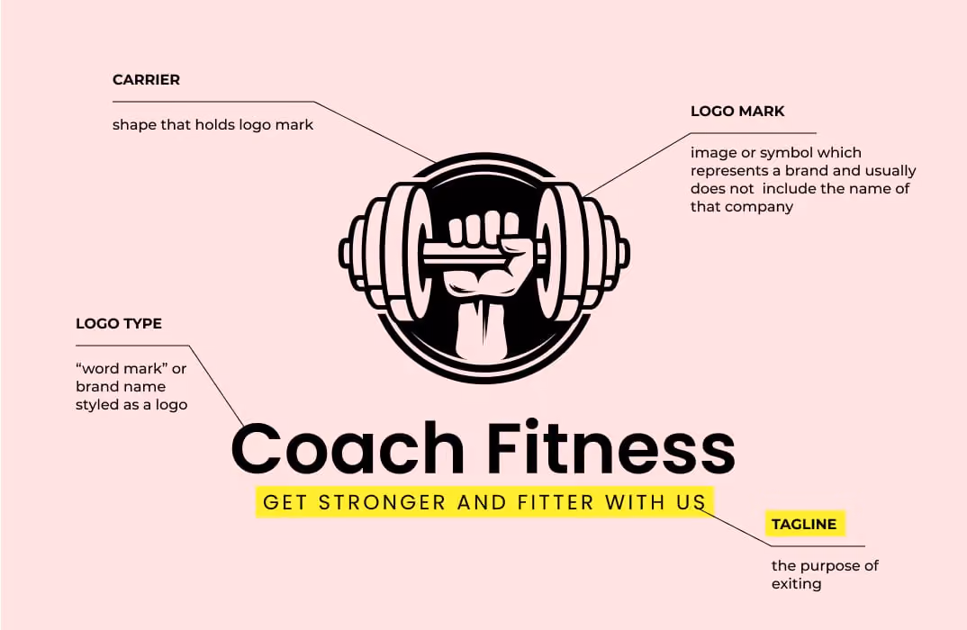
Tagline in Your Fitness Logo
Some of the famous brands use Tagline to power up their messaging. A tagline is like a brand's battle cry. It encapsulates your brand's essence, mission, and promise in a succinct phrase.
A fitting tagline can make all the difference for many fitness brands and businesses where personal journeys and transformations are paramount. Here's how to craft one and integrate it seamlessly into your logo:
1. The Power of Brevity:
While your tagline needs to convey a message, it should do so concisely. The most memorable taglines are often short and punchy, making a quick but lasting impression. Think Nike's "Just Do It" - short, actionable, and powerful.
2. Reflect Your Brand's Essence:
Your tagline should echo your brand's core values and mission. A tagline like "Find Your Inner Calm" might resonate if you're a yoga studio emphasizing mental peace. On the other hand, a high-intensity boot camp might opt for something like "Push Past Limits."
3. Make it Timeless:
While it's tempting to tap into current trends or slang, remember that a tagline should ideally stand the test of time. Avoid fads that might feel outdated in a few years. Instead, focus on timeless sentiments that will resonate across generations.
4. Integration with Logo:
Once you've crafted the perfect tagline:
Positioning: Ensure it doesn't overshadow your brand name in the logo. It should complement, not dominate. Typically, taglines are placed below the brand name or logo graphic.
Typography: It's crucial to ensure your tagline's font harmonizes with the rest of the logo. While it doesn't necessarily have to be the same font, it shouldn't clash.
Visibility: Despite its smaller size relative to the main logo, your tagline should still be legible, especially when the logo is scaled down.
5. Test and Feedback:
Before finalizing, get feedback. Share your tagline with trusted peers, mentors, or even potential clients. Gauge their reactions, and see if the tagline evokes your intended emotions and associations.
6. Stay Open to Evolution:
While a tagline should be timeless, it's also essential to understand that as your brand grows and evolves, so might your tagline. Stay open to revisiting and tweaking it as your fitness business matures.
A tagline can be the cherry on top of your brand's visual representation, adding depth and clarity. It's a small component with the potential to make a significant impact. Craft it carefully, ensuring it aligns with what your fitness brand stands for, and watch it play.
Mistakes You Can Avoid in Your Fitness Logo Design
Designing a fitness logo may seem straightforward, but numerous pitfalls can detract from its effectiveness. As you embark on your logo design journey, steer clear of these common mistakes to ensure that your brand is represented in the best light:
A. Overcomplication:
Less is often more when it comes to logo design. A complex logo can confuse potential clients, making them less likely to remember your brand.
Key Takeaway: Prioritize simplicity. A simple design is more versatile, easily recognizable, and often more aesthetically appealing. Stick to a few colors and avoid cramming many design elements or details. Aim for clarity and instant recognition.
B. Following Fads:
While jumping on the latest design trend bandwagon is tempting, remember that trends come and go. What's 'in' today might look outdated in a few years.
A fitness studio with a trendy logo must update it every couple of years, making the recall retention low.
Key Takeaway:
Your logo should have a timeless quality. Instead of mimicking the latest design trend, focus on creating something unique and reflective of your fitness brand's values. This will ensure longevity and relevance over time.
C. Neglecting Responsiveness:
In today's digital age, your business name and logo will be displayed across various platforms – from smartphone apps to gym banners.
Passerby's looking at your gym logo subconsciously retain the memory of your brand and will return as clients when in need of your services. This also emphasizes the importance of having a design that denotes the true essence of your brand. For example, if your gym logo looks more like a bakery logo, people may pass it without realizing what's inside.
Key Takeaway:
Ensure your logo is versatile. It should retain its clarity and appeal, whether it's on a business card, a website, or gym equipment. Invest time in ensuring it's scalable and looks consistent across all mediums.
D. Ignoring Copyright Issues:
Nothing can be more detrimental to a brand than facing legal issues soon after its launch.
Key Takeaway: Always strive for originality in your design. Avoid using stock images or icons that might be in use by other brands. Once you've finalized your logo, consider trademarking it. This protects you from others copying your design and ensures you're not inadvertently infringing on someone else's intellectual property.
People Also Ask (PAA)
1. What are the key elements of an effective fitness business logo?
An effective fitness business logo should include:
- Simplicity: Ensures the logo is easily recognizable.
- Relevance: Reflects the nature of your fitness services.
- Versatility: Looks good across various platforms and mediums.
- Memorability: Leaves a lasting impression on potential clients.
- Appropriate Color Scheme: Utilizes colors that evoke desired emotions and align with your brand identity.
These elements collectively contribute to a logo that effectively represents your fitness brand.
2. How does color psychology influence fitness logo design?
Color psychology plays a significant role in logo design by influencing perceptions and emotions.
- Red: Conveys energy and passion, suitable for high-intensity fitness programs.
- Blue: Represents trust and calmness, ideal for wellness and yoga studios.
- Green: Symbolizes health and growth, fitting for holistic and health-focused fitness services.
Selecting colors that align with your brand's message can enhance the effectiveness of your logo.
3. Why is understanding the target audience important in logo design?
Understanding your target audience ensures that your logo appeals to the demographics you aim to attract.
For instance, a logo designed for a youth-oriented, high-energy fitness club may differ significantly from one intended for a senior wellness center.
Aligning your logo with the preferences and expectations of your target audience can enhance brand connection and engagement.
4. What role does typography play in a fitness business logo?
Typography influences the perception of your brand's personality.
- Bold, sans-serif fonts: Convey strength and modernity, suitable for high-intensity training facilities.
- Elegant, serif fonts: Impart a sense of tradition and reliability, fitting for established wellness centers.
Choosing the right font style ensures that your logo communicates the desired brand attributes effectively.
5. How can incorporating fitness-related symbols enhance a logo?
Incorporating fitness-related symbols, such as dumbbells, yoga poses, or running figures, can immediately convey the nature of your business.
These visual cues help potential clients quickly understand your services, making your brand more approachable and memorable.
Conclusion
Designing a compelling logo is the first step in shaping the identity of your fitness brand. As you move forward, remember you're not alone in this journey. Fitbudd is here to assist, offering tailored solutions for fitness coaches.
Fitbudd ensures you're well-equipped to make a lasting impression in the fitness world, from onboarding to branding needs, like logo designing. So, as you venture ahead, remember the essence of your brand, and let Fitbudd handle the rest.


Meet the author
Tanya Sharma
Tanya Sharma is a logo design virtuoso, renowned for her ability to distill brand essence into visually striking, unforgettable logos that redefine brand identity.
Frequently Asked Questions
Yangzey Sherpa leads content strategy at FitBudd, overseeing content planning and execution across fitness-focused digital channels. With over five years of experience in SEO and content, she works closely with the fitness industry to ensure content aligns with the needs of coaches, trainers, and gym owners. Her role keeps her deeply connected to fitness business workflows, coaching models, and how professionals use digital platforms to grow.
Apra Pathak has worked closely within the fitness niche for several years, supporting personal trainers and fitness coaches through content and digital marketing initiatives. Her experience centers on understanding how fitness professionals build visibility, communicate value, and engage clients online. Through sustained involvement with fitness-focused platforms and audiences, she has developed a strong understanding of the digital needs and growth challenges faced by modern fitness businesses.
Aishwarya Mehra has been actively involved in fitness-focused digital marketing, working closely with brands and platforms that serve coaches, trainers, and fitness businesses. Her experience spans engagement-driven strategies designed specifically for fitness audiences. Through ongoing exposure to fitness campaigns and communities, she remains closely aligned with how fitness professionals attract, convert, and retain clients in digital environments.
Suchandra Das has contributed content within the fitness niche, working on resources designed for coaches, trainers, and fitness business owners. Her experience involves supporting fitness-related topics with clear, structured, and accessible content. Through consistent involvement with fitness-focused platforms, she has developed familiarity with coaching workflows, client communication, and the informational needs of fitness professionals.
FitBudd is a fitness technology platform built exclusively for coaches, personal trainers, gym owners, and fitness professionals. The platform supports fitness businesses through branded apps, white-labeled solutions, and websites designed around real coaching and training workflows. FitBudd works closely with the global fitness community, maintaining deep, ongoing involvement in the fitness industry.
Ankit Uniyal has worked extensively with fitness-focused content, supporting platforms that cater to personal trainers, gym owners, and fitness professionals. His experience includes optimizing and structuring content around fitness-related search behavior and user intent. Through continued involvement in the fitness niche, he has gained a strong understanding of how trainers and coaches build discoverability and authority online.
Saumya Mittal is the Co-Founder and CEO of FitBudd. Since 2021, she has been actively engaged in the fitness technology sector, collaborating with global fitness companies to foster digital growth and scalable operations. With over a decade of experience leading high-impact projects in engineering and operations, Saumya has a strong background in developing reliable and scalable systems. Through FitBudd, she is dedicated to addressing the evolving needs of fitness professionals worldwide.
Kinshuk Snehi has been closely involved in the fitness space for over four years. Through his work at FitBudd, he has contributed to shaping how fitness professionals build their online presence, attract clients, and scale sustainable coaching businesses. Deeply interested in the intersection of fitness, technology, and growth, Kinshuk brings a hands-on understanding of the challenges faced by modern trainers. His passion lies in building systems and strategies that support long-term consistency, both in fitness journeys and business growth.
Kanika Verma has been closely involved in building solutions for the fitness industry, working with platforms used by coaches and trainers globally. Her experience includes direct exposure to fitness coaching workflows and operational needs. Through sustained involvement in fitness-focused product development, she has developed a strong understanding of how fitness professionals manage clients, programs, and daily operations.
Tanya Sharma has worked on branding initiatives within the fitness niche, supporting fitness platforms and businesses with visual identity design. Her experience includes creating brand systems used by coaches, trainers, and fitness-focused products. Through ongoing involvement in fitness-related design projects, she remains closely connected to how fitness brands communicate trust and professionalism.
Niharika Sonavane has contributed to visual design projects within the fitness industry, supporting platforms and brands serving fitness professionals. Her experience spans creating digital assets used across fitness apps, websites, and marketing materials. Through continued work in the fitness niche, she remains closely aligned with the visual communication needs of coaches and fitness businesses.
Elesh Patel has worked extensively on marketing initiatives within the fitness niche, managing paid campaigns for fitness-focused products and services. His experience includes supporting platforms that target personal trainers, gym owners, and fitness creators. Through long-term involvement in fitness marketing, he remains closely connected to how fitness professionals discover and adopt digital tools.


Grow Your Fitness Business Using Social Media Guide
Unlock the potential of social media to attract clients and grow your business with our expert tips.
Download Now
Templates
These functional templates have the power to make any fitness trainer's life easier.
Subscribe To
Our Blog


